
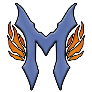
New logo!
Hey everyone! I’ve gotten a new logo.
Why? Well because I’ve decided I want to be myself on the internet, so instead of always hiding behind “Yazuka”, I now just want to be me. Micke Johansson. So I made this M-like logo. I like it myself. But there are some places that I will still be “Yazuka”. Like on Youtube, Deviantart, Gamefaqs, gametrailers. And other sites.
But I’ll be using this logo instead. So yeah, if you see it, its probably me. =)
Sadly the miniature doesn’t look as good as the big one IMO, but I have no idéa how to fix it. =/
So hopefully if I have the time, I’ll try to remake the whole site design, I’m trying to go for a more simple yet, clean design. And compared to what it was in the beginning I’m slowly getting there. So I’ll just keep fighting until I finally get a design I’m pleased with. And a question. Is there anything you would like to see on my site? I’m gotten some request from friends, to put up a friends page. Would that be okay, for you (yes, you know who you are) if I put up some minor info on you too? Or perhaps something else? I feel like I want to expand in some sort of way. I need to do something.
I like the logo, it’s very you-like, metal-ish and tough. ;)
And yeah sure the friends page stuff is okay with me, if im supposed to be on it ;)
Haha, thank you. =) Of course you are! =O
Wouldn’t want it any other way! :D
And I’ll say it here again, it is so fucking brilliant. You amaze me man. The things you can do. Wow.
I wonder what an L-icon for me would look like if you made one. :)
Edit: Oh yeah, and I’m oki with the friends page thingy too.
Thank you. ^^
Hehe, I can always try making something. Just to see if it turns out good.
I actually got some kind of idéa already. Might start skissing on it a bit later, I have all the time in the world now when I’m at school. XD
Yay! Then I might add something later then. Just have to try and get a base of something for it first.
We’ll see what happens. ^^
Cool! :D Thanks a bunch, it’s gonna be cool to see what you might come up with. :)
Hehe, it will probably be something like the M.
I mean in the same style of sharpness. Or how I should put it. Hm..
Oh, well. We will se how it turns out.
Any special color you would like to have on it?
Well, I love blue. ;) Not baby or navy blue though. Something in the middle. :)
Hm… I’ll try to see if I can get something done.
I’m currently in the processes in remaking some of the site. You migth have noticed?
So I’m hoping I can get it more like I want. ^^
GREEN, forest GREEN!
You want that? =O
Or did you mean soemthing elese? XD
Yeah I noticed! :D I think it looks good! Good luck with the rest of it. :)
Hey, it’s my logo, not yours! XP
Wish for your own! ;P ;)
Maybe make it half green half blue? ;)
Depends on what green would be used.
Or, maybe on blue logo and one green, so I can change it if I want.
Yeah, I can do that.
If I can get online on loading I’m going to show you the little sketch I’ve done.
As I said before I’m continuing in this sharper alphabet style, so I hope you like it. ^^